How much time is there left to act?
March 7, 2013 arctic-news
The Arctic often has the world's highest temperature anomalies, as illustrated by the image below showing anomalies above 6 degrees Celsius over almost the entire Arctic Ocean (averaged over 30 days from Jan. 24 to Feb. 22, 2014).

Image added February 2014. Source: Massive Methane Concentrations over the Laptev Sea
The image below shows a forecast of 7.85 degrees Celsius for the Arctic on February 2014, with anomalies appearing to exceed 20 degrees Celsius in many areas.

Image added Jan. 2014. Source: Climate Reanalyzer, where daily updates are available.
The image below shows that average world land temperature has risen approximately 1.5 degrees Celsius in the past 250 years, and about 0.9 degrees Celsius in the past 50 years.

Image added August 2012. Source: Berkely Earth, who add that the NASA GISS record had a land
mask applied and the HadCRU curve is the simple land average, not the hemispheric-weighted one.
The graph below shows NASA data for the years 1980 to 2011.

Below is a similar graph from 1964 to 2011, this time for the higher latitudes of the northern hemisphere, and expressed as temperature anomalies from the 20th century average.

Above graph shows average annual land temperature anomalies. Since the Arctic only constitutes a relatively small part of Earth, it's easy to overlook what's happening there when looking at global averages.
Projections into the future typically use global averages in the form of relatively straight lines pointing at temperature anomalies of 2°C up to 4.5°C in the year 2100, depending on the mitigation scenario. An example of this is the IPCC image below.

In the Arctic, temperatures are rising much faster than elsewhere, and at times huge peaks can appear in some areas. Such peaks are typically masked in temperature graphs that show annual mean temperature anomalies for the entire Arctic. Averaging data annually and over a large area can mask peaks that occur locally and over short time-periods.

Image added March 2014
For both the years 2010 and 2011, NASA recorded mean anomalies of over 2°C at all higher latitudes (64N to 90N). For specific latitudes, anomalies can be even higher, e.g. latitudes 79N and 81N reached anomalies of over 3°C in 2010.
For specific months, anomalies can be very high. In November 2010, anomalies of 12.5°C were recorded at latitude 71N, longitude -79 (Baffin Island, Canada). At specific moments in time and at specific locations, anomalies can be even more striking. As an example, on January 6, 2011, temperature in Coral Harbour, located at the northwest corner of Hudson Bay in the province of Nunavut, Canada, was 30°C (54°F) above average.
Warming in the Arctic is accelerating, and this makes it hard to fit straight trend lines to such rises. Instead, exponential trends fit the data better, as shown below. The added trend line shows how temperature anomalies are projected to continue, based on historic data from 1964 to 2011.

This is a later version of the Nov 2011 image added to the poster displayed at AGU 2011
The image below combines these two kinds of warming, i.e. accelerated warming in the Arctic and global warming as that affects all places on Earth, including the Arctic.

The image below also has a trend line added for global warming as experienced everywhere on Earth, which shows up as a relatively straight line, much like the IPCC projections. This clearly shows how much warming in the Arctic is accelerating, something that is easily overlooked when only looking at global averages.

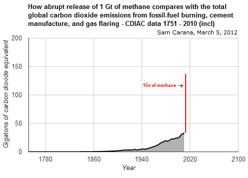
There is a third kind of warming to watch out for, i.e. runaway global warming. The danger of such huge temperature rises in the Arctic is that they will trigger releases of methane from hydrates and free gas in sediments under the sea. What will be the impact of abrupt release of, say, 1Gt of methane? Let's compare this with the global carbon dioxide emissions from fossil-fuel burning, cement manufacture, and gas flaring, as illustrated by the image below, based on CDIAC data 1751-2010 (incl).

Methane has an initial global warming potential (GWP) of over 100 times that of carbon dioxide. Abrupt release of 1Gt of methane would thus have an immediate additional impact equivalent to over 100Gt of carbon dioxide, as illustrated by the image below.
 Abrupt release of 1Gt of methane is pictured above as a one-off pulse. Its impact, however, will persist over many years, not only due to the direct effect of methane, but also due to indirect effects.
The IPCC gives methane a 12.4 year lifetime, with its warming impact declining over the years, in the end only persisting as carbon dioxide, as pictured below.


Image added 2013. Source: Methane hydrates
However, crucially important is methane's local warming potential (LWP), which includes the indirect effect of triggering further releases. In case of a large abrupt release, methane's lifetimewill be extended, due to hydroxyl depletion. The methane can be expected to persist locally for decades, at its highest LWP, since there's very little hydroxyl in the atmosphere above the Arctic in the first place, so very little methane will get oxidized there. The impact of such an abrupt release will be felt most strongly in the Arctic, where the release took place. Since it will take time for methane to spread away from the Arctic, much of the entire release will remain concentrated above the Arctic.
The additional warming that this will cause in the Arctic will make the sea ice decline even more dramatically than is already the case now. The combined LWP of sea ice loss and methane is huge. This is bound to trigger further releases of methane in the Arctic, and their joint impact will accumulate, as illustrated in the image below.

In other words, while the danger is that runaway warming will first strike in the Arctic, it will soon spread, threatening to cause heatwaves and firestorms across North America and Siberia, which will add additional soot and carbon dioxide in the atmosphere globally, as forests, peat bogs and tundras at higher latitudes will burn, threatening to escalate in runaway global warming.
The image below also includes an estimate for the current emissions from hydrates.

Image added Jan. 2014, from this source
The image below depicts the three kinds of warming:
1. Global warming
2. Accelerated warming in the Arctic
3. Runaway global warming

Related posts
For a discussion of the many feedbacks that accelerate warming in the Arctic, also see the posts How extreme will it get? and The Biggest Story of 2013.
Notes
Editor's note 1: Above post was written early 2012 and, while it is preserved largely as it was when first added, many of the images were updated over time, as indicated in the captions. A later version of the image with trendlines for the three kinds of warming is added below, from the post Arctic Methane Impact.

Editor's note 2: In case you're looking for the post by Malcolm Light, earlier posted here under this title, the original post is still at the geo-engineering blog, but it has meanwhile been complemented by the February 2012 post Global Extinction within one Human Lifetime as a Result of a Spreading Atmospheric Arctic Methane Heat wave and Surface Firestorm.
March 7, 2013 arctic-news
The Arctic often has the world's highest temperature anomalies, as illustrated by the image below showing anomalies above 6 degrees Celsius over almost the entire Arctic Ocean (averaged over 30 days from Jan. 24 to Feb. 22, 2014).

Image added February 2014. Source: Massive Methane Concentrations over the Laptev Sea
The image below shows a forecast of 7.85 degrees Celsius for the Arctic on February 2014, with anomalies appearing to exceed 20 degrees Celsius in many areas.

Image added Jan. 2014. Source: Climate Reanalyzer, where daily updates are available.
The image below shows that average world land temperature has risen approximately 1.5 degrees Celsius in the past 250 years, and about 0.9 degrees Celsius in the past 50 years.

Image added August 2012. Source: Berkely Earth, who add that the NASA GISS record had a land
mask applied and the HadCRU curve is the simple land average, not the hemispheric-weighted one.
The graph below shows NASA data for the years 1980 to 2011.

Below is a similar graph from 1964 to 2011, this time for the higher latitudes of the northern hemisphere, and expressed as temperature anomalies from the 20th century average.

Above graph shows average annual land temperature anomalies. Since the Arctic only constitutes a relatively small part of Earth, it's easy to overlook what's happening there when looking at global averages.
Projections into the future typically use global averages in the form of relatively straight lines pointing at temperature anomalies of 2°C up to 4.5°C in the year 2100, depending on the mitigation scenario. An example of this is the IPCC image below.

In the Arctic, temperatures are rising much faster than elsewhere, and at times huge peaks can appear in some areas. Such peaks are typically masked in temperature graphs that show annual mean temperature anomalies for the entire Arctic. Averaging data annually and over a large area can mask peaks that occur locally and over short time-periods.

Image added March 2014
For both the years 2010 and 2011, NASA recorded mean anomalies of over 2°C at all higher latitudes (64N to 90N). For specific latitudes, anomalies can be even higher, e.g. latitudes 79N and 81N reached anomalies of over 3°C in 2010.
For specific months, anomalies can be very high. In November 2010, anomalies of 12.5°C were recorded at latitude 71N, longitude -79 (Baffin Island, Canada). At specific moments in time and at specific locations, anomalies can be even more striking. As an example, on January 6, 2011, temperature in Coral Harbour, located at the northwest corner of Hudson Bay in the province of Nunavut, Canada, was 30°C (54°F) above average.
Warming in the Arctic is accelerating, and this makes it hard to fit straight trend lines to such rises. Instead, exponential trends fit the data better, as shown below. The added trend line shows how temperature anomalies are projected to continue, based on historic data from 1964 to 2011.
This is a later version of the Nov 2011 image added to the poster displayed at AGU 2011
The image below combines these two kinds of warming, i.e. accelerated warming in the Arctic and global warming as that affects all places on Earth, including the Arctic.
The image below also has a trend line added for global warming as experienced everywhere on Earth, which shows up as a relatively straight line, much like the IPCC projections. This clearly shows how much warming in the Arctic is accelerating, something that is easily overlooked when only looking at global averages.
There is a third kind of warming to watch out for, i.e. runaway global warming. The danger of such huge temperature rises in the Arctic is that they will trigger releases of methane from hydrates and free gas in sediments under the sea. What will be the impact of abrupt release of, say, 1Gt of methane? Let's compare this with the global carbon dioxide emissions from fossil-fuel burning, cement manufacture, and gas flaring, as illustrated by the image below, based on CDIAC data 1751-2010 (incl).
Methane has an initial global warming potential (GWP) of over 100 times that of carbon dioxide. Abrupt release of 1Gt of methane would thus have an immediate additional impact equivalent to over 100Gt of carbon dioxide, as illustrated by the image below.
Abrupt release of 1Gt of methane is pictured above as a one-off pulse. Its impact, however, will persist over many years, not only due to the direct effect of methane, but also due to indirect effects.The IPCC gives methane a 12.4 year lifetime, with its warming impact declining over the years, in the end only persisting as carbon dioxide, as pictured below.

Image added 2013. Source: Methane hydrates
However, crucially important is methane's local warming potential (LWP), which includes the indirect effect of triggering further releases. In case of a large abrupt release, methane's lifetimewill be extended, due to hydroxyl depletion. The methane can be expected to persist locally for decades, at its highest LWP, since there's very little hydroxyl in the atmosphere above the Arctic in the first place, so very little methane will get oxidized there. The impact of such an abrupt release will be felt most strongly in the Arctic, where the release took place. Since it will take time for methane to spread away from the Arctic, much of the entire release will remain concentrated above the Arctic.
The additional warming that this will cause in the Arctic will make the sea ice decline even more dramatically than is already the case now. The combined LWP of sea ice loss and methane is huge. This is bound to trigger further releases of methane in the Arctic, and their joint impact will accumulate, as illustrated in the image below.
In other words, while the danger is that runaway warming will first strike in the Arctic, it will soon spread, threatening to cause heatwaves and firestorms across North America and Siberia, which will add additional soot and carbon dioxide in the atmosphere globally, as forests, peat bogs and tundras at higher latitudes will burn, threatening to escalate in runaway global warming.
The image below also includes an estimate for the current emissions from hydrates.
Image added Jan. 2014, from this source
The image below depicts the three kinds of warming:
1. Global warming
2. Accelerated warming in the Arctic
3. Runaway global warming
Related posts
For a discussion of the many feedbacks that accelerate warming in the Arctic, also see the posts How extreme will it get? and The Biggest Story of 2013.
Notes
Editor's note 1: Above post was written early 2012 and, while it is preserved largely as it was when first added, many of the images were updated over time, as indicated in the captions. A later version of the image with trendlines for the three kinds of warming is added below, from the post Arctic Methane Impact.

Editor's note 2: In case you're looking for the post by Malcolm Light, earlier posted here under this title, the original post is still at the geo-engineering blog, but it has meanwhile been complemented by the February 2012 post Global Extinction within one Human Lifetime as a Result of a Spreading Atmospheric Arctic Methane Heat wave and Surface Firestorm.
No comments:
Post a Comment